
Exploring Hacker News by mapping and analyzing 40 million posts and comments for fun
The above is a map of all Hacker News posts since its founding, laid semantically i.e. where there should be some relationship between positions and distances. I've been building it and some other interesting stuff over the past few weeks, to play around with text embeddings. Given that HN has a lot of interesting, curated content and exposes all its content programatically, I thought it'd be a fun place to start.
A quick primer of embeddings: they are a powerful and cool way to represent something (in this case, text) as a point in a high-dimensional space, which in practical terms just means an array of floats, one for its coordinate in that dimension. The absolute position doesn't really mean much, but their relativity to each other is where much of their usefulness comes in, because "similar" things should be nearby, while dissimilar things are far apart. Text embeddings these days often come from language models, given their SOTA understanding of the meaning of text, and it's pretty trivial to generate them given the high-quality open source models and libraries, that are freely accessible to anyone with a CPU or GPU.
Going in, my theories for what I could do if I had the embeddings were:
- Powerful search: given HN's curated high bar of content, I knew there were lots of interesting insights and things I've missed over the years. It'd be cool if I could query something like "how to communicate well" and instantly surface the best advice over the years for communicating.
- Recommendations: it might be possible to build a personalized discovery engine by navigating the latent space of HN content biased towards/away from dis/interest areas.
- Analysis: there are a lot of opinions on HN. It should be possible to calculate the sentiment and popularity of various topics within the community, find opposing viewpoints, etc.
These sounded pretty interesting, so I decided to dive right in. In this blog post, I'll lay out my journey starting from no data and no code, to interactive search, analysis, and spatial visualization tools leveraging millions of HN content, dive into all the interesting diverse problems and solutions that came up along the way, and hopefully give you some indication (and hopefully motivation) of the power and applicability of embeddings in many areas.
You may also have better ideas of using the data or the demo that I came up with. I'm also opening up all the data and source code that I built as part of this journey, and invite you to use them to play around, suggest and refine ideas, or kick off your own creative projects and learning journeys. Over 30 million comments and 4 million posts are available to download here, which include metadata (IDs, scores, authors, etc.), embeddings, and texts (including crawled web pages). The code is also completely open source; feel free to fork, open PRs, or raise issues. If you do end up using the code or data, I'd appreciate a reference back to this project and blog post.
If you want to jump right to the demo, click here. Otherwise, let's dive in!
Fetching items from HN
HN has a very simple public API:
GET /v0/item/$ITEM_ID.json
Host: hacker-news.firebaseio.com
Everything is an item, and the response always has the same JSON object structure:
{
  "by": "dhouston",
  "descendants": 71,
  "id": 8863,
  "score": 111,
  "time": 1175714200,
  "title": "My YC app: Dropbox - Throw away your USB drive",
  "type": "story",
  "url": "http://www.getdropbox.com/u/2/screencast.html"
}
There's also a maxitem.json API, which gives the largest ID. As of this writing, the max item ID is over 40 million. Even with a very nice and low 10 ms mean response time, this would take over 4 days to crawl, so we need some parallelism.
I decided to write a quick service in Node.js to do this. An initial approach with a semaphore and then queueing up the fetch Promises, despite being simple and async, ended up being too slow, with most CPU time being spent in userspace JS code.
It's a good reminder that Node.js can handle async I/O pretty well, but it's still fundamentally a single-threaded dynamic language, and those few parts running JS code can still drag down performance. I moved to using the worker threads API and distributed the fetches across all CPUs, which ended up saturating all cores on my machine, mostly spent in kernel space (a good sign). The final code ended up looking something like:
new WorkerPool(__filename, cpus().length)
  .workerTask("process", async (id: number) => {
    const item = await fetchItem(id);
    await processItem(item);
  })
  .leader(async (pool) => {
    let nextId = await getNextIdToResumefrom();
    const maxId = await fetchHnMaxId();

    let nextIdToCommit = nextId;
    const idsPendingCommit = new Set<number>();
    let flushing = false;
    const maybeFlushId = async () => {
      if (flushing) {
        return;
      }
      flushing = true;
      let didChange = false;
      while (idsPendingCommit.has(nextIdToCommit)) {
        idsPendingCommit.delete(nextIdToCommit);
        nextIdToCommit++;
        didChange = true;
      }
      if (didChange) {
        await recordNextIdToResumeFrom(nextIdToCommit);
      }
      flushing = false;
    };

    const CONCURRENCY = cpus().length * 16;
    await Promise.all(
      Array.from({ length: CONCURRENCY }, async () => {
        while (nextId <= maxId) {
          const id = nextId++;
          await pool.execute("process", id);
          idsPendingCommit.add(id);
          maybeFlushId();
        }
      }),
    );
  })
  .go();
WorkerPool is a helper class I made to simplify using worker threads, by making it easy to make type-checked requests between the main thread and a pool of worker threads. The parallelism fetched things out-of-order, so for idempotency, I recorded the marker in order so I don't skip anything if it is interrupted.
Some interesting things I noticed about the HN items returned by the API:
- Scores never seem to be below -1.
- You can't get the downvotes for posts, and the votes at all for comments.
- Some posts and comments have blank titles and texts/URLs, despite not being flagged or deleted; I presume they were moderated.
- It's possible for comment IDs to have be smaller than an ancestor, probably due to a moderator moving the comment tree.
I've exported the HN crawler (in TypeScript) to its own project, if you're ever in need to fetch HN items.
Generating embeddings
My initial theory was that the title alone would be enough to semantically represent a post, so I dove right in with just the data collected so far to generate some embeddings. The Massive Text Embedding Benchmark (MTEB) is a good place to compare the latest SOTA models, where I found BGE-M3, the latest iteration of the popular FlagEmbedding models that came out last year. Their v3 version supports generating "lexical weights" for basically free, which are essentially sparse bags-of-words, a map from token ID to weight, which you can use with an algorithm like BM25 in addition to the normal "dense" embeddings for hybrid retrieval. According to their paper, this increases retrieval performance significantly.
The infrastructure required for generating embeddings is not so trivial:
- Models are computationally expensive, with good ones having anything from millions to billions of parameters.
- Like most AI models, they are much more efficient to compute on GPUs, but GPU clusters are expensive.
- Inference can take hundreds of milliseconds, meaning a processing rate in the ballpark of tens per second. That's almost a year to process 40 million inputs on one GPU.
- The GPUs are likely separate from our data and server machines. A way to ensure a flowing full pipe from our data to our GPUs will ensure our GPUs are not expensively idling.
Fortunately, I discovered RunPod, a provider of machines with GPUs that you can deploy your containers onto, at a cost far cheaper than major cloud providers. They also have more cost-effective GPUs like RTX 4090, while still running in datacenters with fast Internet connections. This made scaling up a price-accessible option to mitigate the inference time required.
The GPUs were scattered around the world, so DB connection latency and connection overhead became a problem, and the decentralized client-side pooling caused a lot of server overhead. I created db-rpc to mitigate these aspects. It's a simple service that proxies SQL queries over HTTP/2 to a local DB with a large shared connection pool. HTTP/2 supports multiplexing (= many queries, one connection, no blocking), lighter connections, and quicker handshakes, so for the simple queries I'm making (CRUD statements), it worked great.
A simple message queue was needed to distribute the item IDs to embed to the various GPU workers, which is exactly what AWS SQS offers. Unfortunately, it has quite low rate limits and is expensive per message, which is annoying given the millions of tiny job messages. Some batching can mitigate this partially, but I often need something like this, so I created queued, a RocksDB-based queue service written in Rust. It handles 100K+ op/s with one node, so there's no worrying about batching, message sizes, rate limits, and costs. RocksDB's write-optimized design makes for a great queue storage backing.
The optimizations paid off: after scaling to ~150 GPUs, all 40 million posts and comments were embedded in only a few hours. A snapshot from my Grafana dashboard indicates some of the impact:
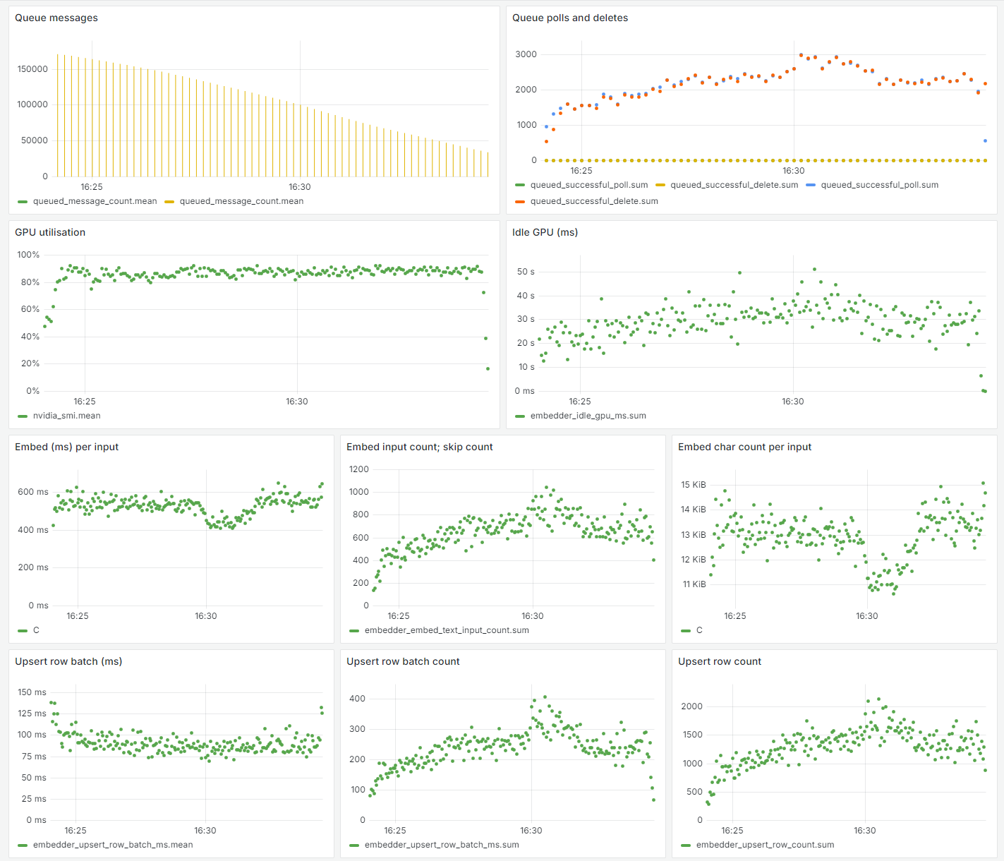
The GPU utilization stayed peak for the entire time, and the processing rate was stable. Connection latencies remained steady and low on average despite many distributed workers and concurrent queries, although there was not as much batching because it was quite expensive to embed each input (at around 600 ms per input), as previously mentioned.
Adding additional context by crawing the web
Unfortunately, my theory about the titles being enough did not pay off. While it worked well for most posts because they have descriptive titles, a lot have "strange", creative, ambiguous titles that don't play well with the embedding model. Also, the model tended to cluster Ask HN and Show HN posts together, regardless of topic, probably because, given that the entire input was just the title, those two phrases were significant. I needed more context to give to the model.
For text posts and comments, the answer is simple. However, for the vast majority of link posts, this would mean crawling those pages being linked to. So I wrote up a quick Rust service to fetch the URLs linked to and parse the HTML for metadata (title, picture, author, etc.) and text. This was CPU-intensive so an initial Node.js-based version was 10x slower and a Rust rewrite was worthwhile. Fortunately, other than that, it was mostly smooth and painless, likely because HN links are pretty good (responsive servers, non-pathological HTML, etc.).
Extracting text involved parsing the HTML using the excellent scraper, removing semantically non-primary HTML5 elements, and traversing the remaining tree.
A lot of content even on Hacker News suffers from the well-known link rot: around 200K resulted in a 404, DNS lookup failure, or connection timeout, which is a sizable "hole" in the dataset that would be nice to mend. Fortunately, the Internet Archive has an API that we can use to use to programmatically fetch archived copies of these pages. So, as a final push for a more "complete" dataset, I used the Wayback API to fetch the last few thousands of articles, some dating back years, which was very annoying because IA has very, very low rate limits (around 5 per minute).
Our end tally of pages that could not be fetched:
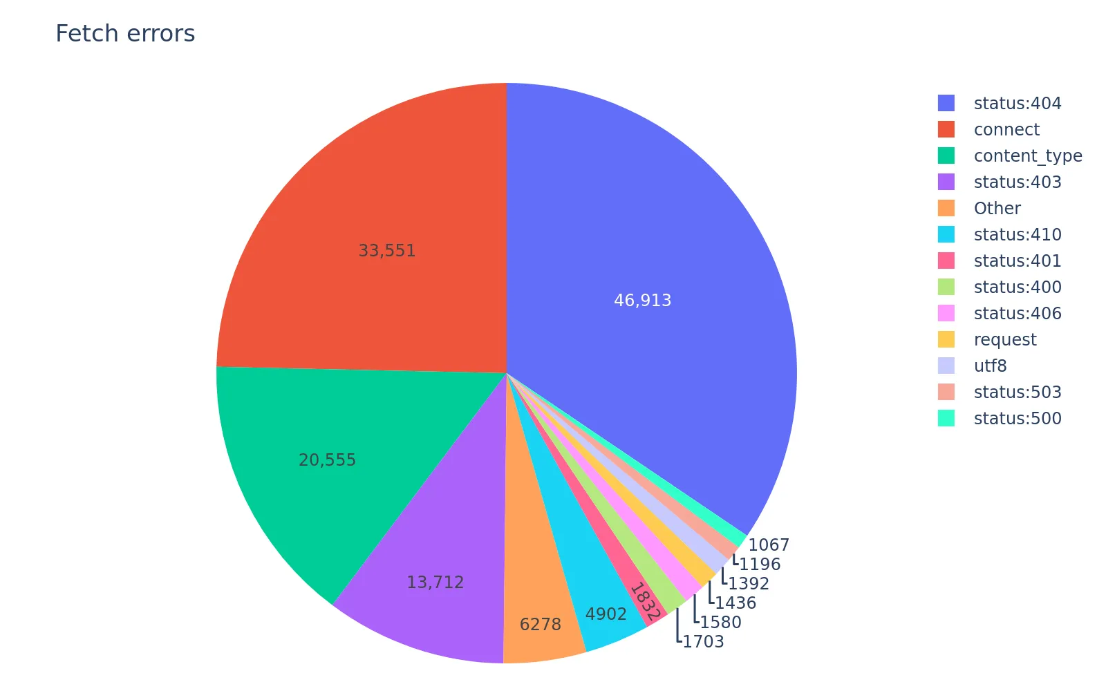
Not bad, out of 4 million. That's less than 5% of all fetched pages.
Embeddings, attempt two
Web pages are long, but luckily the BGE-M3 model supports a context window of 8192 tokens. However, the model is really slow, as we saw previously, so I decided to switch to jina-embeddings-v2-small-en which has a far smaller parameter count, while still having good performance (according to MTEB). This saved a lot of time and money, as the inference time dropped to 6 ms (100x faster):
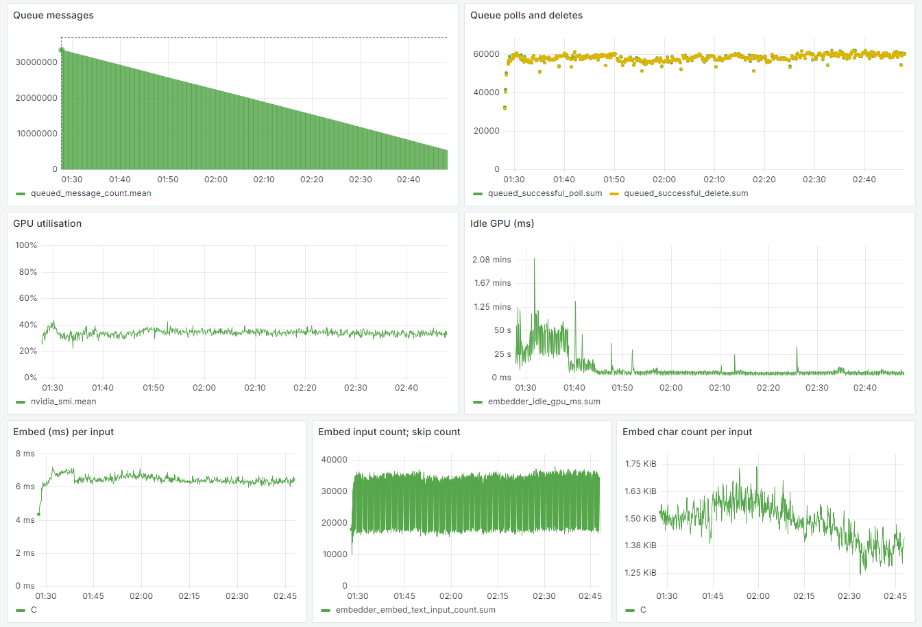
The GPUs could not actually be saturated, because any increase in batch size would cause OOMs due to the extended length of the inputs.
Some pages did not have a lot of text (e.g. more creative visual pages), or could not be fetched at all. To still ensure these posts still had decent context, I packed the top HN comments for those posts after the page text as extra "insurance":
const topComments = item.kids?.slice() ?? [];
const MAX_LEN = 1024 * 64; // 64 KiB.
while (topComments.length && embInput.length < MAX_LEN) {
  // Embellish with top-level top comments (`item.kids` are ranked already). This is useful if the page isn't primarily text, could not be fetched, etc.
  const i = await fetchItem(topComments.shift()!);
  // We don't want to include negative comments as part of the post's text representation.
  if (!i || i.type !== "comment" || i.dead || i.deleted || i.score! < 0) {
    continue;
  }
  const text = extractText(i.text ?? "");
  if (!addedSep) {
    // Use Markdown syntax, colon, and ASCII border to really emphasise separation.
    embInput += "\n\n# Comments:\n==========";
    addedSep = true;
  } else {
    embInput += "\n\n----------";
  }
  embInput += "\n\n" + text;
}
embInput = embInput.slice(0, MAX_LEN);
For comments, many refer to parents or ancestors, so wouldn't make sense alone. Using a similar approach, I traversed comments' ancestors and built up a longer context with everything up to the post title. Now, the inputs for posts and comments were nice and full of context, hopefully corresponding to more accurate, useful embeddings.
One thing I did this time round was to create a kv table that could hold arbitrary keys and values, and store these large values (embeddings, texts, etc.) there. When stored alongside the row, they would make the row "fat" and updates to any column (even for a tiny value) were expensive. Schema changes were also expensive. These weren't worth the benefits of having these mostly-opaque values within a row, which were basically none.
UMAP
Uniform Manifold Approximation and Projection (UMAP) is a dimensionality reduction technique, which means to take our large 1024-dimension embedding vectors and turn them into points in fewer dimensional space while still (trying) to preserve most of the semantic relationships between points. PCA and t-SNE are similar algorithms in this space you may have heard of, but UMAP is newer and makes the case that it offers a better performance-accuracy trade-off than the others. Regardless of which algorithm, dim. reduction is often used to visualize embeddings, because it's hard to "see" points in 1024-dimensional space. We'll use UMAP to reduce our embeddings to 2D space, so we can scatter plot it and do some basic eyeballing for basic checks and anything interesting with our dataset.
Generating the 2D embeddings is not hard. UMAP takes in two main things: a PyNNDescent graph, and the original embeddings. There are a few hyperparameters that affect the distribution of points in the lower dim. space, as well as the primary parameter: the target dimensionality.
import umap

with open("ann.joblib", "rb") as f:
    ann = joblib.load(f)
knn_indices, knn_dists = ann.neighbor_graph
mat_emb = np.memmap("emb.mat", dtype=np.float32, mode="r", shape=(N_ITEMS, 512))

mapper = umap.UMAP(
    precomputed_knn=(knn_indices, knn_dists, ann),
    n_components=2,
    metric="cosine",
    n_neighbors=N_NEIGHBORS,
    min_dist=MIN_DIST,
)
mapper.fit(mat_emb)
# Save the lower dim. embeddings.
mat_umap = mapper.embedding_
with open("emb_umap.mat", "wb") as f:
    f.write(mat_umap.tobytes())
# Save the UMAP model for later use.
with open("umap-model.joblib", "wb") as f:
    joblib.dump(mapper, f)
Training is highly parallel and, with millions of high dim. inputs, can take a while, so I spun up a c7i.metal-48xl VM on EC2. After about an hour and a half, maxing out the 96-core processor, it was done, and an equivalent (N_ITEMS, 2) matrix was available. I saved both the 2D embeddings, as well as the trained model which can be later used to transform other embeddings without running the fitting process again.
Let's now plot these 2D embeddings and see what we find.
import matplotlib.pyplot as plt

mat_umap = load_umap()

plt.figure(figsize=(10, 10))
plt.gca().invert_yaxis()
plt.scatter(mat_umap[:, 0], mat_umap[:, 1], s=1)

plt.savefig("umap.webp", dpi=300, bbox_inches="tight")
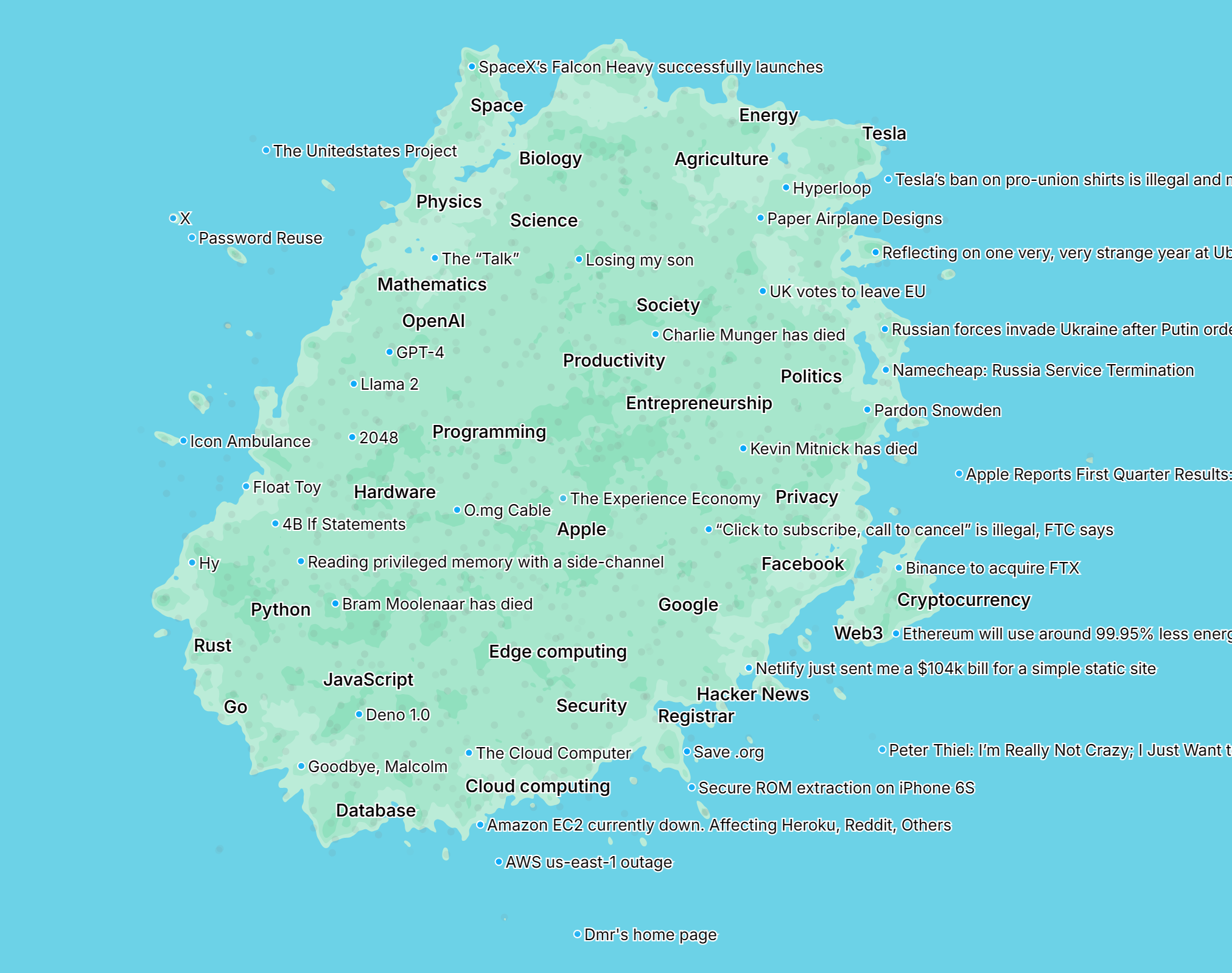
Oops, too many points. Let's do a quick and easy way to reduce the points by tiling into a fine (but finite) grid and selecting only the highest-scoring post from each cell. Let's also add some titles so we see how those points relate:
import pyarrow

df = pyarrow.feather.read_feather("posts.arrow", memory_map=True)
df_titles = pyarrow.feather.read_feather("post_titles.arrow", memory_map=True)
df = df.merge(df_titles, on="id", how="inner")
df["x"] = mat_umap[:, 0]
df["y"] = mat_umap[:, 1]

x_range = df["x"].max() - df["x"].min()
y_range = df["y"].max() - df["y"].min()
grid_size = 100
df["cell_x"] = df["x"] // (x_range / grid_size)
df["cell_y"] = df["y"] // (y_range / grid_size)
df = df.sort_values("score", ascending=False).drop_duplicates(["cell_x", "cell_y"])

plt.figure(figsize=(50, 50))
plt.gca().invert_yaxis()
plt.scatter(df["x"], df["y"], s=1)
for i, row in df.sample(n=1000).iterrows():
    plt.annotate(row["text"], (row["x"], row["y"]), fontsize=3)
It's a bit hard to see (there are still lots of points and text labels, so the image is very high resolution), but if you open the image and zoom in, you can see the 2D space and the semantic relationships between points a bit more clearly:
It also looks like adding more context paid off, as those previously-mentioned posts with "exotic" titles are now placed in more accurate points near related content.
Cosine similiarity
All the data is now ready. A lot of using embeddings involves finding the similarity between them. This is basically the inverse of the distance: if something is far away (high distance), it's not similar (low similarity), and vice versa. From school, we may think of one way to measure the distance between two points:
x1, y1 = (2, 3)
x2, y2 = (4, 5)
dist = math.sqrt((x2 - x1)**2 + (y2 - y1)**2)
Most of us knows the formula as the Pythagorean theorem, and this way of calculating distance is known as the Euclidean distance, which feels intuitive to us. However, it's not the only way of calculating distance, and it's not the one commonly used for text embeddings.
You may have seen the cosine metric used a lot w.r.t. embeddings and semantic similarity. You might be wondering why the euclidean distance isn't used instead, given how more "normal" it seems in our world. Here's an example to demonstrate why:
We can see that in this case, where perhaps the X axis represents "more cat" and Y axis "more dog", using the euclidean distance (i.e. physical distance length), a pitbull is somehow more similar to a Siamese cat than a "dog", whereas intuitively we'd expect the opposite. The fact that a pitbull is "very dog" somehow makes it closer to a "very cat". Instead, if we take the angle distance between lines (i.e. cosine distance, or 1 minus angle), the world makes sense again.
In summary, cosine distances are useful when magitude does not matter (as much), and when using the magnitude would be misleading. This is often the case with text content, where an intense long discussion about X should be similar to X and not an intense long discussion about Y. A good blog post on this is Euclidean vs. Cosine Distance by Chris Emmery.
Going forward, we'll use the cosine distance/metric/similarity a lot. The core of it is:
dist = corpus_embeddings @ query_embeddings.T
sim = 1 - dist
The @ operator performs a dot product. Normally, you then divide by the product of their magnitudes, but in this case, they are unit vectors, so that isn't needed.
Building a map
Wouldn't it be cool to have an interactive visualization of the latent space of all these embeddings, a "map of the Hacker News universe" so to speak? Something like Google Maps, where you can pan and zoom and move around, with terrain and landmarks and coordinates? It sounds like a fun and challenging thing to try and do!
I first scoped out how this map should work:
- Zooming in (via pinching or the mousewheel) should increase the amount of points shown, and points should get farther apart.
- Some points should be labelled, but not all because it would get cluttered and text would overlap.
- Clicking a point should show more details about that post.
- It should be in the browser, as a web app, that works well on mobile and desktop and touch and mouse.
Basically, it should work like you'd expect, like Google Maps.
Preparing the map data
There are millions of points, not ideal to send all at once to the client. Working backwards, there are two "axes" that dictate the points shown: position and zoom, so structuring and segmenting the data alongst those lines is a good start.
The first thing that came to mind was tiling: divide the map space into a grid, then pack all points into each cell. The client can load tiles on-demand as they need to, instead of the whole map. There are probably more sophisticated ways of tiling, esp. given that points aren't distributed evenly and clients have different viewports, but the effectiveness is great given its simplicity. A tile can simply be referred to by its (x, y) coordinate, and stored in any KV datastore (e.g. S3), making it easy to distribute and requiring no server-side logic.
For zooming, my approach was a loop for each Level of Detail (LOD), subdividing into 2x more grid cells per axis (and therefore 4x more points), but making sure to first copy over all points picked by the previous level, because the user doesn't expect a point to disappear as they zoom in.
I aimed for each tile to be less than 20 KiB when packed, a balance between fast to load on mediocre Internet and sizable to avoid excessive fetches. This limited tiles to around 1,500 points: 4+4 bytes for the (x, y), 4 bytes for the ID, and 2 bytes for the score.
To ensure a diverse set of points per tile, I further subdivided each tile to pick at least something from each area; this reduced the chance that a less-populated area in the fringes seems completely non-existent on the map from afar. Any remaining capacity was taken by sampling uniformly, which should visually represent the background distribution on the map.
The code is pretty straightforward and self-explanatory in the build-map service, so I won't repeat the code here.
Building the web app
It took a while to figure out the best approach. Using even thousands of DOM elements (one for each point) completely trashed performance, so that was out of the picture. Having a giant Canvas, dynamically rendering points only as they come into view, and changing its DOM position and scale when panning/zooming, didn't work either; the points would grow in size when zooming in, and at sufficiently large zoom levels, the image became too big (clearing the Canvas took too long, and memory usage was extreme). Eventually I settled on a Canvas and drawing on every update of the "viewport", which represents the position and zoom level of the current user. Despite needing to redraw potentially thousands of points on every frame (to feel smooth and responsive), this worked really well, and was the simplest approach.
I kept the labelling algorithm simple: repeatedly pick the highest scoring post (a reasonable metric), unless the label would intersect with another existing label. R-trees can do the job of finding box collisions well, and thankfully RBush exists, an excellent and fast R-tree implementation in JS. There exists a measureText() API in the browser, but fetching thousands (or more) titles just to measure them and pick a handful was neither fast nor efficient, so I packed post title lengths into a byte array (so a thousand would only be ~1 KB) and simply used a tuned formula to approximate the length, which worked reasonably well:
The one-off initial calculations of these boxes and collisions was CPU intensive and caused stuttering, so I moved it to its own thread using Web Workers. I also experimented with OffscreenCanvas, but it didn't do much; the render logic was very efficient already, and given that 99% of the app was the map (represented by the Canvas), having "the rest of the app" still respond while the map was rendering was not very useful.
Adding some visual appeal and guidance
There was something still disorienting and "dull" about the map. Real maps have landmarks, cities, borders, terrains, and colors; there is a sense of direction, orientation, and navigation as you browse and navigate the map. Let's try to add some of those, analogizing where necessary.
Terrain and borders will require some analogizing, since there are no real geographical or geopolitical features of this map. If you look on Google Maps, you'll notice that there are shades of terrain, but no smooth gradients. They are contours, quickly informing the viewer of the intensity of something compared to everywhere else, in their case vegetation. For our map, intensity could represent density of points, quickly signifying where there's a lot of interest, activity, content, engagement, popularity, discussion, etc. It would also provide some of the orientation, because a user can sense their movement based on the shifting terrain.
Kernel Density Estimation would seem like the perfect tool for this job. Basically, you take a bunch of discrete values and generate a smooth curve around it, inferring the underlying distribution. Matthew Conlen created a cool visual walkthrough explaining intuitively in more detail. Unfortunately, attempts using standard libraries like SciPy took too long. However, as I was playing around with them, something occurred to me when I saw "Gaussian kernel" (one option for KDE): why not try Gaussian blurring? They seem to be related: when you blur an image, you have a kernel and apply a Gaussian function, which when you look at its plot, it essentially "pushes out" values from the kernel's center (in layman's terms) — this is how you get the smoothing effect from blurs. Would applying such a blur also "push out" and smooth the many discrete sharp points into a meaningful representation of the approximate density?
My approach will be to map each point to a cell in a large grid with the same aspect ratio, where each cell's value will be the count of points mapped to it. If the grid is too small, everything's clumped together, but if it's too big, everything's too far apart and it's mostly sparse everywhere, so finding a balance is necessary.
ppc = 32 # Points per cell (approximate).
x_min, x_max = (xs.min(), xs.max())
y_min, y_max = (ys.min(), ys.max())
grid_width = int((x_max - x_min) * ppc)
grid_height = int((y_max - y_min) * ppc)

gv = pd.DataFrame({
    "x": (xs - x_min).clip(0, grid_width - 1).astype("int32"),
    "y": (ys - y_min).clip(0, grid_height - 1).astype("int32"),
})
gv = gv.groupby(["x", "y"]).size().reset_index(name="density")

grid = np.zeros((grid_height, grid_width), dtype=np.float32)
grid[gv["y"], gv["x"]] = gv["density"]
grid = gaussian_filter(grid, sigma=1)

g_min, g_max = grid.min(), grid.max()
level_size = (g_max - g_min) / levels
grid = (grid - g_min) // level_size
# Some values may lie exactly on the max.
grid = np.clip(grid, 0, levels - 1)
Let's quickly render an image, using the values as the alpha component, to see how it looks so far.
alpha = grid.astype(np.float32) / (levels - 1) * 255

img = np.full(
    (grid_height, grid_width, 4),
    (144, 224, 190, 0), # Green-ish.
    dtype=np.uint8,
)
img[:, :, 3] = alpha.astype(np.uint8)

Image.fromarray(img, "RGBA").save("terrain.webp")

It does not look so good. It looks like most cells were zero, and there are seemingly very few areas with any actual posts.
I have a theory: just as the distribution of votes/likes on social media across posts exhibit power-law distributions, perhaps the same is true of the popularity of topics? If there were a few topics that are posted about 10x more than most others, then it could explain the above map, as few areas would fall in the middle tiers. Let's apply a log to the values:
gv["density"] = np.log(gv["density"] + 1)

That looks much nicer. It also has implicit "borders" at the places where different log(density) levels meet, which is cool.
Instead of rendering it as a giant image, which is inefficient to transport and blurry when zoomed in, I'll create SVG paths instead, given that there are literally only 4 colors in this entire figure. On the client, I'll draw and fill in these paths that form a polygon. This will ensure that the "terrain" looks sharp (including at borders) even when zoomed in. I'll use OpenCV's built-in contour functions to calculate the path around these levels and export them as a closed polygon.
shapes: Dict[int, List[npt.NDArray[np.float32]]] = {}
for level in range(levels):
    shapes[level] = []
    num_shapes, labelled_image = cv2.connectedComponents((grid == level).astype(np.uint8))
    # Ignore label 0 as it's the background.
    for shape_no in range(1, num_shapes):
        shape_mask = labelled_image == shape_no
        # Use RETR_EXTERNAL as we only want the outer edges, and don't care about inner holes since they'll be represented by other larger-level shapes.
        shape_contours, _ = cv2.findContours(shape_mask.astype(np.uint8), cv2.RETR_EXTERNAL, cv2.CHAIN_APPROX_SIMPLE)
        for shape_border_points in shape_contours:
            # The resulting shape is (N, 1, 2), where N is the number of points. Remove unnecessary second dimension.
            shape_border_points = shape_border_points.squeeze(1)
            if shape_border_points.shape[0] < 4:
                # Not a polygon.
                continue
            # We want level 0 only when it cuts out an inner hole in a larger level.
            if level == 0 and (0, 0) in shape_border_points:
                continue

            # Convert back to original scale.
            shape_border_points[:, 0] = shape_border_points[:, 0] / ppc + x_min
            shape_border_points[:, 1] = shape_border_points[:, 1] / ppc + y_min
            shapes[level].append(shape_border_points.astype(np.float32))
Cities
I also wanted to add some "cities" (representing the common topic within some radius), so you can find your way around and not get lost in the many points and titles shown at once, and have some sense of direction and where to start. The UMAP model has been saved, so all that's necessary is to embed the city names and get their (x, y) position using the UMAP model:
CITIES = ["Programming", "Startups", "Marketing", ...]
embs = model.encode(CITIES)
points = umapper.transform(embs)
There were some automated ways of doing this that I explored a bit. Using LLMs to generate these automatically. K-means clustering to figure out optimal points and radii. Unfortunately, it was not so trivial: it was hard to prompt the LLM to output what I expected, likely because describing the task was not trivial, and K-means did not find a lot of meaningful clusters that I would (as a human labeller) group together. You'd expect that there would be some hierarchy, but some topics are really popular on their own (sometimes even more than their logical "parent"), like "Programming" vs. "Rust", so they needed to be shown at the same detail level. Ultimately, it only required a few cities before it looked good, so manually walking the map and jotting down a few cities only took an hour or so.
Pushing things to the edge
As you're browsing the map, you want it to feel snappy and responsive, because you're trying to find something, get immersed, get orientated, etc., and having parts be blank or partial interrupts this flow. Therefore, I knew I needed to reduce the time it took to get the map onto the screen. The rendering part was fast, it was fetching the data that took a while; I had started by putting all the map data on Cloudflare R2 in the ENAM region, but the latency was too high (600 ms to a few seconds) despite the physical latency being ~200 ms. However, even 200 ms was not really great, given that 100 ms is the treshold where things feel "instant". Given that the limitation was a law of physics, there was only one real way to reduce that latency and that was to move the data closer to the user. So I spun up a few tiny servers in major regions: Virginia, San Jose, London, and Sydney (near me). I wrote a basic Rust server to ship out the data and get the most bang-for-buck from these tiny servers (plus, why spend all this effort only to have a slow server?), and had some tiny JS to pick the nearest server from the client:
const EDGES = [
  "ap-sydney-1",
  "uk-london-1",
  "us-ashburn-1",
  "us-sanjose-1",
] as const;

const edge = await Promise.race(
  EDGES.map(async (edge) => {
    // Run a few times to avoid potential cold start biases.
    for (let i = 0; i < 3; i++) {
      await fetch(`https://${edge}.edge-hndr.wilsonl.in/healthz`);
    }
    return edge;
  }),
);
Some anycast, CDN, etc. solution may have been even cooler, but likely costly and overkill.
One thing that puzzled me was how much more memory was being used by the process compared to the actual data itself. The data is built once then pushed to all the edge servers, and it's in MessagePack format, so it has the bloat from type markers and property names. Once deserialized into Rust structures, it should all be memory offsets. So I was surprised when memory usage was 2-4x the source data size. I could only really think of four reasons:
- I used the wrong type (e.g.
f64instead off32). - Struct padding.
- Vec, HashMap overallocation.
- Memory allocator fragmentation or other inefficiency.
I didn't look too much into this, but it was the one thing left that otherwise made the edge setup pretty neat and efficient. If anyone has any ideas, let me know.
Testing out the search
Now that we got our app and data all up and running, let's see if our theory about better query comprehension and search results pans out. Let's try a simple query: "entering the tech industry".
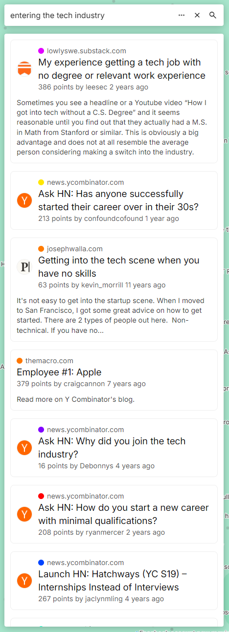
It gives some nice results, both upvoted and less noticed ones, and seem to be pretty relevant and helpful. Compare this to HN's current search service:
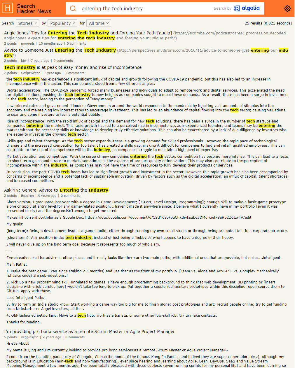
We can see the power of semantic embeddings over something like literal text matching. Of course, we could try more queries and get better results, but the embeddings-powered search engine got it immediately, did not return only part of the results, and there was no need to optimize the query or "reverse engineer" the algorithm.
How about a question, instead of just matching?

It gave us results about WeWork over the years, from layoffs to stock tank to bankruptcy, a nice holistic view. Notice that the results don't literally contain the words "what happened", and most aren't even questions. The model seems to have "understood" our query, which is pretty nice considering this isn't some generative model, just cosine distances.
There is one quirk: the bottom result is completely irrelevant. This is largely my fault; I did not filter out results that are too dissimilar, so it ended up including generic results. This is something trivially fixable though.
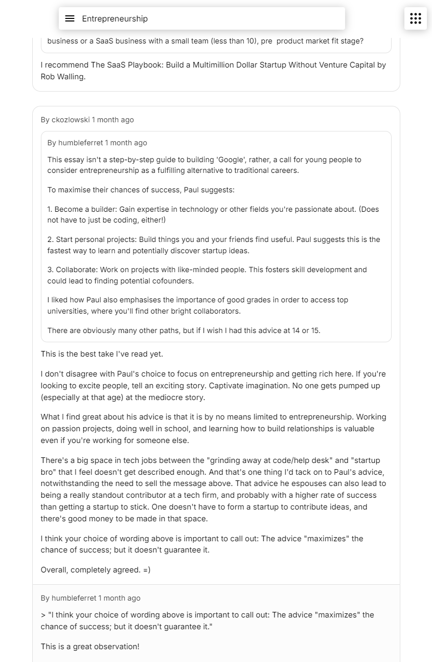
Given the curated quality of HN posts (and scores), can we find some sage advice over the years about something important, like say career growth, just by typing something simple?

Seems pretty good to me: not literally matching the words so creative, interesting, diverse essays showed up. The curation of HN really helps here; I did a quick comparison to the results from a well-known search engine and these results seemed far better. Obviously they have a much more difficult job and far more sophisticated pipelines, but it goes to show that good data + powerful semantic embeddings can go pretty far.
I've hard-coded some interesting queries I found into the app, which show up as suggestions; everything from "linus rants" to "self bootstrapping" to "cool things with css". Try them out and any other queries. What works well? What doesn't? Did you find anything interesting, rare, and/or useful? Let me know!
One thing I haven't mentioned yet is that the results are not directly the similarity matches. There are weights involved in calculating the final score (i.e. rank), and cosine similarity is a big one but not the only one.
Another important one is score. This may not seem as necessary given how powerful these embedding models are, but it is, even with 100% accurate models. Consider two posts talking about some topic, say Rust. One is written by steveklabnik. Another one says that Rust is terrible because it's a garbage-collected dynamic scripting language. To the model, these are both (mostly) talking about Rust, so they are very close together. Yet, it's obvious to most people that the latter should not be ranked as high as the former. (It should probably be filtered out entirely.) This highlights the importance of social proof in search and recommendation systems, because there are things that the model doesn't understand (and maybe never can) because of context, trends, events, etc. Incorporating the score ensures some social proof is taken into consideration.
Another weight is time. Some queries usually prefer newer content to older ones. The common example is news about some recent event; usually it's more important to show the latest updates than yesterday's or some distant but similar event. We can incorporate this by adding a negative weight component proportional to log(age), so that non-fresh content quickly drops off.
Automatic virtual subcommunities
Another neat feature enabled by these embeddings is "virtual" subcommunities. Just type a community name (or description) and all the posts that meet some similarity threshold show up, like your very own subreddit on the fly. Hacker News doesn't have the ability to further subdivide posts, so this was a cool way to have a curated set of posts focused on a specific interest.

If you're wondering where those snippets and images came from, that's what the crawler was extracting and storing as metadata for each page. It usually comes in handy down the line when you want to show/list the pages as results somewhere, as otherwise you'd only have a URL. While I could've also saved the site icon metadata, it's tricky to parse, so I decided to keep it simple by just fetching /favicon.ico of the domain on the client side.
It's just as possible to show interesting comment threads and discussions. Unfortunately, scores aren't available to us, so we can only sort by timestamp, but luckily most comments on HN are pretty useful and insightful:
It would be an interesting challenge to try and rank the comments without the score, perhaps involving user comment histories, engagement around that comment, and the post, topic, and contents. This may be something as simple as a linear equation, to a deep learning model.
We can also see who are the most influential, active, passionate about something by calculating how many comments a user makes proportional to the similarity.
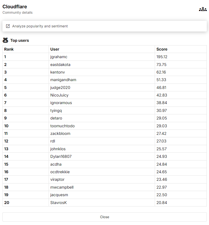
We can see that this works well: jgrahamc and eastdakota are the CTO and CEO of Cloudflare respectively. We managed to do this without needing to classify each comment or use a more fragile and inaccurate keyword-based search. All it takes is some matrix operations:
q = model.embed("cloudflare")
df_comments["sim"] = mat_comments @ q
min_threshold = 0.8
df_comments_relevant = df_comments[df["sim"] >= min_threshold]
df_scores = df_comments_relevant.groupby("author").agg({"sim": "sum"}).reset_index().sort_by("sim", ascending=False)[:20]
One important realisation was that pre-filtering is really slow and usually unnecessary compared to post-filtering. By pre-filtering, I mean removing rows before doing similarity matching. This is because you end up needing to also remove those corresponding rows from the embedding matrix, and that can mean having to reconstruct (read: gigabytes of memory copying) the entire matrix or use much slower partially-vectorized computations. It's usually better to just filter the rows after finding the most similar rows i.e. post-filter.
Note that a minimum threshold is important, because "dissimilarity" can be as high as 0.6, which makes the set of non-relevant items (in this case, users) have high scores due to the size of such sets. In this example, most comments aren't talking about Cloudflare, so any user that has a lot of comments would otherwise dominate this leaderboard just by sheer volume of comments as 100,000 * 0.6 is still higher than 500 * 0.999.
Analyzing the entire dataset
What can we do with the 30 million comments? Two things I wanted to try to analyze at scale were popularity and sentiment. Could I see how HN feels about something over time, and the impact that major events has on the sentiment? Can I track the growth and fall of various interests and topics, and how they compare against their competition?
I don't have sentiment data, but there are lots of high-quality open source sentiment classification models, on HuggingFace, using Transformers. I decided to use the TweetEval model as it was similarly trained on social media content. Tweets are short, and I didn't know how well it'd work on contextualized comments (which I added when generating embeddings), so to keep it aligned with the model I only used the comments themselves without adding any context. A queue was created, the comments were pushed, a GPU cluster spun up to process the jobs, and the results were stored.
The model was much smaller, so increasing the batch size was a good idea to get more bang-for-buck from the GPUs. Increasing the batch size uses more VRAM, but decreases the amount of host-GPU memory transfer (which can be the bottleneck given how fast GPUs are) and possibly increases parallelism. It's finicky though, because, at least for transformer-based models, it can sometimes cause memory spikes and OOM errors. This is because the input matrix has to be a "rectangle", so all inputs (which are converted into tokens) must be padded to the longest input length to maintain this constraint. If you have a batch where 4 texts are length 1, then the input size and internal state is relatively small. But if you instead have a batch size of 5 and the next text has length 1024, then all those sizes suddenly jump by thousands. I added some basic code to conservatively guess the optimal batch size given the VRAM, but I'm curious if this problem has already been tackled more dynamically, given its implications for efficiency.
Once the data was ready, it was time for some number crunching. Let's check out the sentiment of Rust over time:
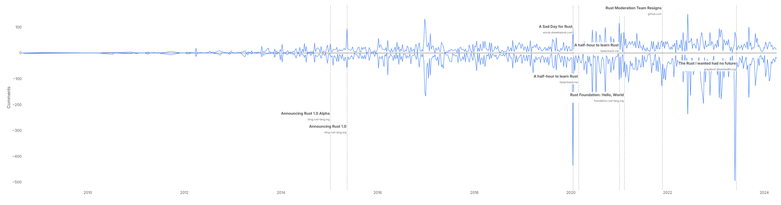
Values below 0 represent the count of negative comments (where confidence of negative sentiment > 0.5) and above 0 represent positive (where confidence of positive sentiment > 0.5); I probably need to polish and clear it up a bit more. Nonetheless, we can see that there's generally a lot of positive sentiment about Rust (which isn't surprising if you've been around on HN). There was a spike in positivity around the 1.0 announcement, which makes sense, and the more negative posts correlated with a lot of negative comments (according to the model). This is similar to how bots measure sentiment on social media and predict the price of stocks; using powerful semantic embeddings would probably beat any keyword- or bag-of-words-based algorithm. I will say, assuming the model is accurate and I did a reasonable job, there seems to be a lot of negative sentiment on HN in general.
We can also estimate the popularity of Rust compared to other languages by weighing the score and similarity. Unfortunately, HN does not expose comment scores, so we can't use them.
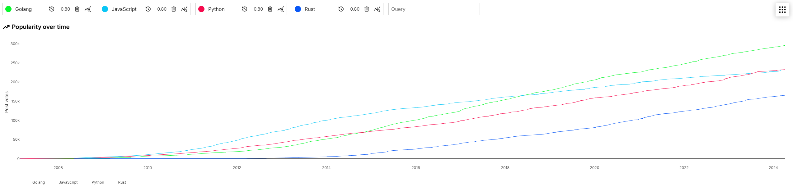
It seems like Rust is doing great, but not as popular as the other languages. Some of the similarity thresholds may need tuning, so I may be wrong here; have a play with it yourself and try various queries and thresholds. Share anything interesting you find!
These were very basic demos and analyses of the data available, and I'm sure there are infinitely more ways to slice and dice the data in interesting, insightful, useful, sophisticated ways. I have many more ideas myself, but wanted to open up the code and data sooner so you can build on top of this, either with more ideas and suggestions, or to play with your own research and visualization projects.
Big data number crunching with a GPU
One last thing before I wrap this long post up. The analysis queries were taking a while (10-30 seconds) to number-crunch for each one, which was annoying when playing around with it. This was on a 32-core machine, so it was not for a lack of horsepower. I was thinking of various ways to index, preprocess, or prepare the data, when it occurred to me that there already exists a powerful device for lots of vectorized number-crunching, and it's why we run all our AI models on it, but it doesn't have to be restricted to those. Fortunately, libraries like CuPy and cuDF exist, which basically have the same API as NumPy and pandas (respectively) but run everything on the GPU, so it was pretty trivial to port over. Now, queries run in hundreds of milliseconds, and life is great. It's so fast I didn't even bother using a built ANN graph.
The only tricky thing was loading the data on the GPU. Given how large the matrix of embeddings was (30M x 512), it was critical to manage memory effectively, because it wasn't actually possible to fit anything more than 1x the matrix in either system or video memory. Some key points:
- Loading in batches can cause a lot of allocations, which can fragment memory, so in reality you may not be able to load in chunks and then concatenate at the end. (Concatenation also requires contiguous memory, which usually means copying into a separate memory location.)
- If you read the bytes from disk, load into a NumPy array, convert into a CuPy array, and then copy over to the GPU, that's 4 copies, 3 of which are in memory.
- CuPy seems to need to have the entire matrix in system memory first before it can copy over to the GPU. For example,
cupy.asarray(np_matrix)actually creates a copy ofnp_matrixin system memory first.
Ultimately I ended up memory-mapping the matrix on disk, preallocating an uninitialized matrix on the GPU of the same size, then copying over in chunks. This had the benefit of avoiding reading from disk into Python memory first, and using exactly 1x the system RAM and VRAM.
Demo
You can find the app at hn.wilsonl.in. The main page is the map and search, but you can find the other tools (communities and analysis) by clicking the button in the top right. If you find an interesting community, analysis, etc., feel free to share the URL with others; the query is always stored in the URL.
Note that the demo dataset is cut off at around 10 April 2024, so it contains recent but not live posts and comments.
What's next
There is much more I wanted to explore, learn, build, but I did not get the time. Some ideas I'm thinking of going into:
- Live data that is continuously kept up to date.
- Deep learning powered recommendations system, a StumbleUpon over the curated HN web.
- Improving search results by training a reranker.
- Interesting "paths" and "journeys" along the map.
- Analyzing users more: who are the most similar/opposite to each other? Who is the most expert in various niches?
- …
However, I'm more interested in hearing from the community. What do you want to see? How useful were these tools? What were shortcomings or things I overlooked? What other cool ideas do you have? Share any thoughts, feedback, interesting findings, complaints—there's likely a lot more potential with these data and tools, and I'm hoping that, by opening it up, there's some interested people who will push this further than I can alone.
If there's any interest in diving deeper or clarifying any aspect of this project, let me know, I'd be happy to. Once again, you can find all the data and code on GitHub.
If you managed to make it all the way here, thanks for reading!